Committente: ENAC S.p.a. Address: Viale Castro Pretorio 118 00185 Rome, Italy
Periodo di Svolgimento: 2004
Opera Intervento:
New Passenger Terminal and access road and car parking.
Prestazioni professionali svolte:
Preliminary
Architectural, Structural, HVAC, sanitary ,fire fighting , IT nets and electrical systems design.
Importo dei lavori: € 5.420.000,00
Aeroporto di Lampedusa (ICAO: LICD)

The Lampedusa airport is located on a small island and is the southernmost part of the Italian border (nearer to the African coast than the Italian one) and is used for connections with Sicily and for tourism.
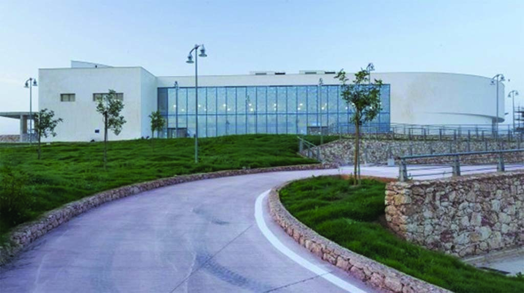
The task was to design a small airport with a low budget (located in an area not easily reachable with construction materials) and with a modern architectural look.
The answer to these needs was a well organized layout, with flexible, wide, comfortable areas for passenger queues and waiting areas and a clear definition of passenger paths.
The architecture was inspired by the shape of a ship and is connected with the use of some traditional materials or architectonic shapes, such as stone and circular wall-fences used by islanders to protect their vegetable gardens from the strong wind that blows on the island.
The building is a one level passenger terminal; the second level is used for administrative offices, a restaurant and a small meeting room.
Outside, on the ground floor, a patio was created for the cafeteria, inside a circular wall-fenced area.
To simplify the construction work, structures are in reinforced concrete and floors were reinforced concrete and hollow tiles mixed.
The choice of materials was imposed by the very low budget. For this reason, the walls are made of plastered and painted bricks and the false ceilings are in mineral fiber.
The glazing is of a high performance kind (solar control system) to mitigate solar radiation.
Light was another important element in the design. Wide glazing facades and indirect lighting from a cut along the top, ensures the right level of natural lighting in the high double space.
In the preliminary design, metallic brise-soleil mounted on metallic supports designed to look like a keel of a ship was considered.
Unfortunately, during construction, the original design was simplified and this part of the building was eliminated.
